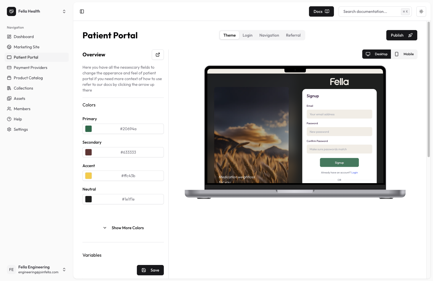
Theme Overview
The theme settings allow you to fully customize the look and feel of your patient portal. You can modify colors, borders, animations, and other visual elements to match your clinic’s branding and create a cohesive user experience.Available Settings
Color Configuration
Customize the color palette of your patient portal:- Primary: Main brand color used throughout the interface
- Secondary: Supporting color for secondary elements
- Accent: Highlight color for important elements
- Neutral: Color used for neutral/gray elements
- Base: Background color for the interface
- Primary Content: Text color on primary backgrounds
- Secondary Content: Text color on secondary backgrounds
- Accent Content: Text color on accent backgrounds
- Neutral Content: Text color on neutral backgrounds
- Base Content: Default text color
- Base 200: Lighter shade of base color
- Base 300: Darker shade of base color
Visual Variables
Fine-tune the visual appearance with these variables:- Border Button: Button border width and style
- Tab Border: Border width for tabs
- Tab Radius: Border radius for tabs
- Rounded Box: Border radius for boxes/cards
- Rounded Button: Border radius for buttons
- Rounded Badge: Border radius for badges
- Animation Button: Button hover/click animations
- Animation Input: Input field animations
- Button Focus Scale: Scale effect when buttons are focused
Best Practices
- Maintain sufficient color contrast for accessibility
- Use consistent border radiuses throughout
- Keep animations subtle and purposeful
- Test your theme across different screen sizes
- Preview both light and dark modes